- Published on
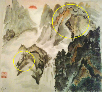
Landscape by Tereza Mitry

After reading my blog post about the creation of my painting “Wolf Howls at Sundown”, Tereza Mitry was inspired to try her own version, using my composition as her model.
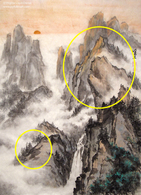
Wolf Howls at Sundown by Virginia Lloyd-Davies

Terry is new to Chinese brush painting and no teachers are available in Egypt where she lives, so she is intuiting her way into a new art technique with the help of the Facebook community and Youtube videos. I am very impressed at how good her eye is and how skilled she is already at handling the rice paper. This is her first big landscape and she is leaping hurdles that would make many students blanch. Her strokes are confident and her waterfall is excellent. Here are the tips I gave her when she asked me for my feedback:

Black Outline on Mountains
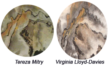
Tip 1. When defining the contours of your mountains in the middle distance, your ink is a little too dark and the line is thin and unbroken. This makes the mountains look like flat cut-outs. Next time, load your brush with grey and put black just at the tip; remove excess moisture on a paper towel and test your brush on scrap paper. Think of contouring (creating roundness) rather than outline. You can fix this issue now by softening the outline in places, using a mid-grey. You don't want an even-width grey ribbon next to the dark line, you want your brush to dance along, creating shadows. This will also help to give the illusion of 3-D.
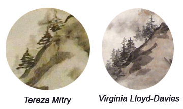
Trees in Distance
Tip 2. Some of your trees in the middle distance look too evenly triangular. Vary the length of the branches to make them look more random and natural. You can fix that now by adding other trees and make the new ones uneven. Also vary the intensity of the ink, making some trees light and others darker. (Check out the two trees on the cliff to the right too and make one taller, or add a greyer tree behind to make them look more natural.)
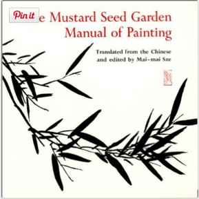
Mustard Seed Garden Manual translated and edited by Mai-mai Sze
Tip 3: The Mustard Seed Garden Manual of Painting is an extraordinary resource. I recommend the Princeton Bollingen edition translated by Mai-Mai Sze. Just remember that the illustrations were originally created for woodblock printing and so you will not see subtleties of gradation (in other words, no greys!). Rocks and mountains will indeed have black contours, but the important difference is that they were painted by calligraphers so the strokes vary in thickness and have the power of calligraphy behind them.
Tip 4: Your painting is less complex than mine; this is to be expected. As you master more elements such as color blending, gradation and mist, you will play with them more and develop your own vocabulary of strokes. This is a never-ending journey of discovery which will bring you much joy. Good luck and happy painting, Tereza Mitry!
To my readers: If you would like feedback on a painting you have created, please fill in the contact form. I will be happy to get back to you with feedback, and, if appropriate, your painting may form the basis of a blog post like this. You can even remain anonymous if you would rather I did not reveal your name when reviewing your painting in a post.
I look forward to more tutorials.
Thank you
Marlene Hopkins