- Published on

Black Ink Sketch on Mulberry Paper
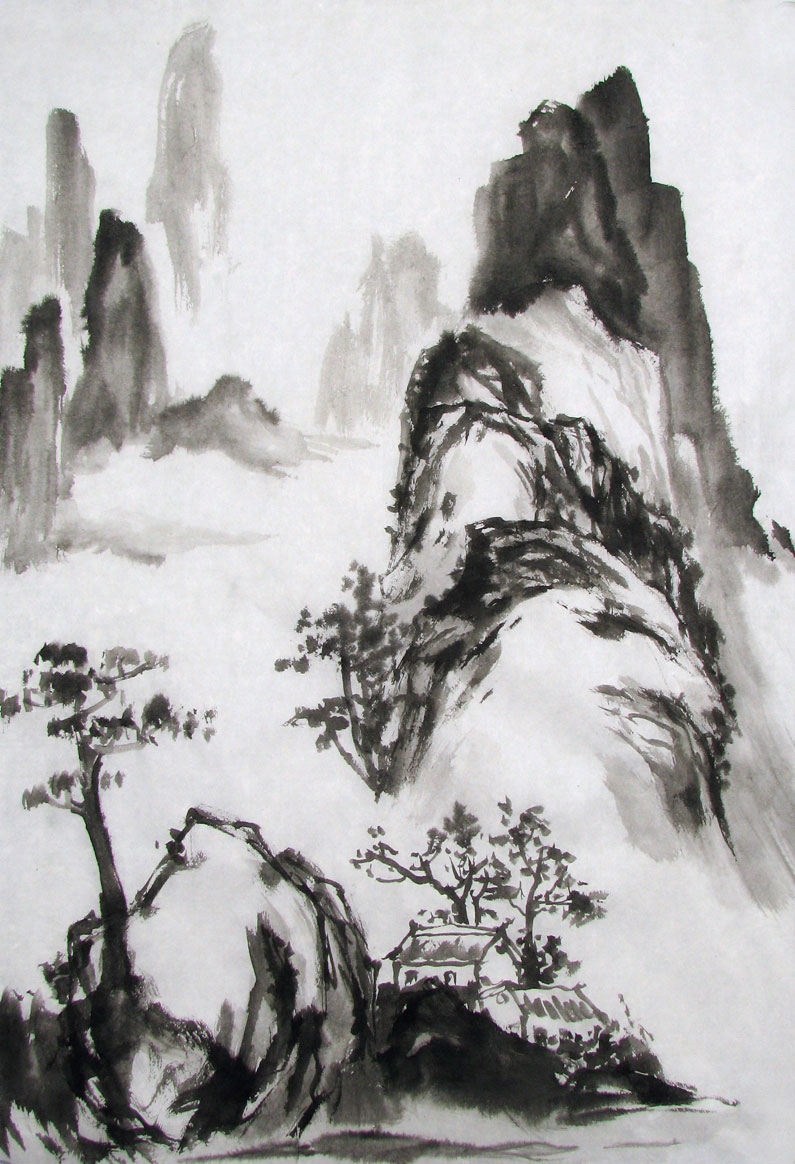
Using just black ink and shades of grey, I started off sketching the rock and tree on the left and worked my way up the scene, spraying lightly with water to dampen the paper in the distance. This softens the outlines. My mulberry paper came from Blue Heron Arts, where you can find an excellent selection of paper, brushes and other painting supplies.
Completed Black Ink Sketch

Rather than leaving the center area open for mist, I opted for showing a meandering waterfall in the distance. I left several areas open for mist.
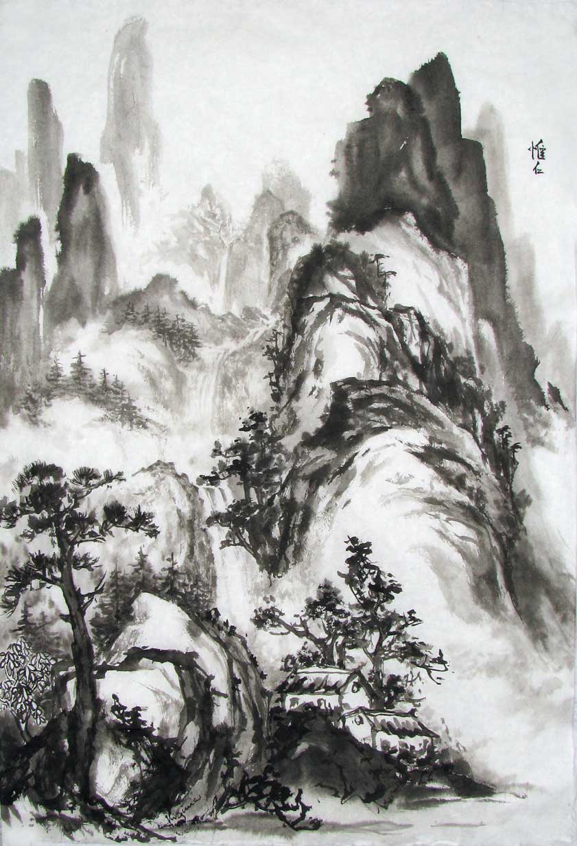
First Layer of Color

Adding light color....Uh-oh, it's all looking a bit brown! The addition of color has taken away from the strong contrast between the black ink and white paper, leaving it looking a bit muddy.

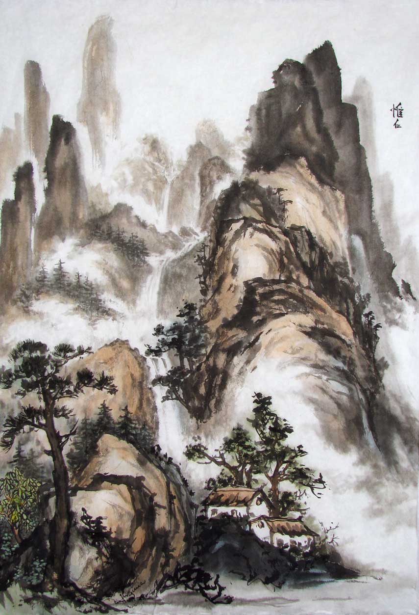
Second Layer of Color
Hmmm, I've added a bit of light, transparent green to the mountains, but it still looks a bit dreary.

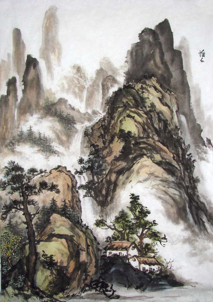
Third Layer of Color
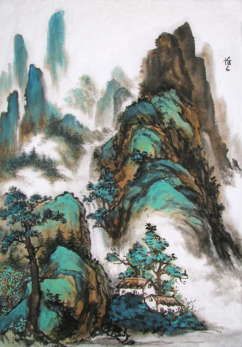
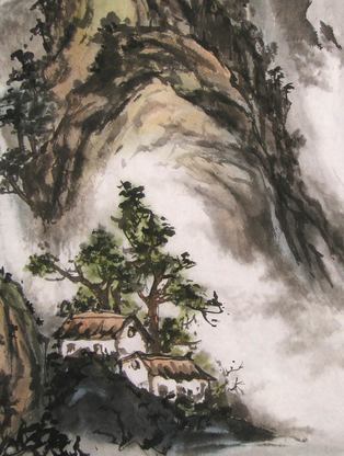
Wahoo! I've intensified the brown on the sides of the rocks and added mineral green and blue! Here's a closeup comparison of the house area:

Mountain & Houses in light colors
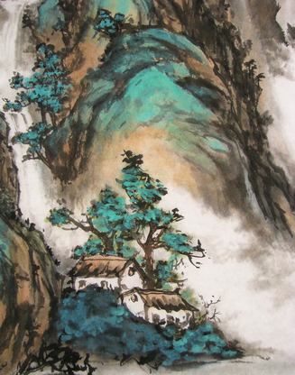
Mountain & Houses in Mineral Colors

Traditionalists might feel I've gone a bit Disney, but the use of mineral green and blue in Chinese landscape paintings goes back hundreds of years. You can see some examples here. And now the final version, complete with chops:
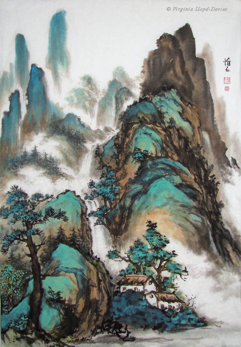
Cosy Cabins in the Mountains

Sometimes 'going for broke' is the most fun of all. I had no idea if the mineral colors would be too much, but I really like it, which is ultimately what counts. Break the rules! Find your own style! It's just a piece of paper, after all! Good luck and happy painting!
6 Comments
This is just the issue I am struggling with, and the color makes such a difference. Many thanks!
Thanks, Barbara. Glad you found this helpful. Of course, the foundation of the composition is the strokes, but we can certainly tweak the shading and where the eye goes by using color. Sometimes we'll go overboard, but we can learn from that too.
Thank you for sharing your hints, especially on producing mist and far away mountains. I will give them a try! You always inspire me!
Thanks, Anne. And thanks for mentioning this blog post in your wonderful newsletter for the Yorkshire CBP group. We all help one another. Happy painting!
I have always loved the traditional blue/green landscape paintings (especially Wang Hui), as well as the modern - almost abstract - versions. I've played around with the technique, even painting the color on the back for a more subtle effect, but I love the vibrancy of your landscape! Give us more! More! More!
Hello Bonnie! Lovely to hear from you! Bet you're a lot warmer than us down there in Florida! Being a 'noisy' painter, I have yet to try painting the mineral colors on the back for a more subtle effect, but I know that it can give a lovely glow to the painting. Glad to hear you're still happily painting.