- Published on
How to paint grapes is one of the fourteen chapters of my sumi-e how-to book.. You can pre-order "Mindful Artist: Sumi-e Painting" at https://quartokno.ws/MindfulArtistSumie or on Amazon at https://amzn.to/2XG2Elf
The book will be out December 3, 2019 - get ahead of the queue by pre-ordering!
The book will be out December 3, 2019 - get ahead of the queue by pre-ordering!
From the "Grapes" chapter

- Published on
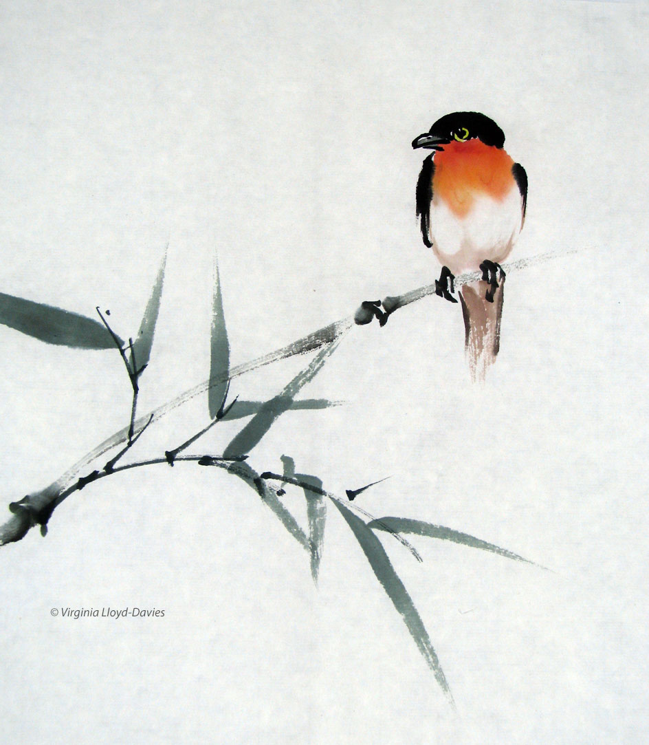
Robin Redbreast

This colorful birdie jumped out of the brush at the top of a rather uninspired bamboo painting. With a little sneaky cropping, I saved the good part! Never underestimate the power of cropping: If you are unhappy with a painting and don't know why, try masking off one of the sides and see if that improves the composition. Sometimes we hate to let go of a favorite element ("look what a wonderful rock I created here!"), but by trimming that bit off, the picture suddenly makes better sense.
Tip: don't cut it off until you're absolutely certain!
Tip: don't cut it off until you're absolutely certain!
- Published on

Name that Bird!
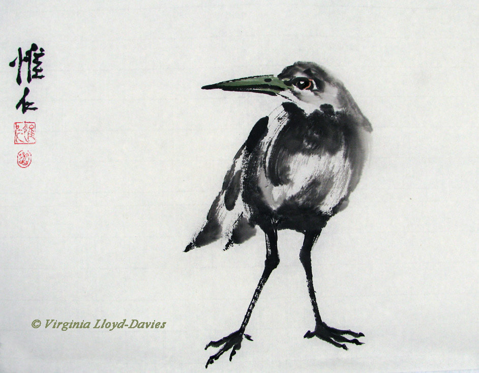
My sumi-e birds just pop out of the brush on to the paper. I rarely plan them out and while I do attempt to get them somewhat anatomically correct, I realize that often exaggeration is what makes them successful. Like this one: I asked my Facebook followers to give me names for him and I loved the variety of suggestions: "Lord Horty", "Wellhellow", "Crook" and "Themistocles", were offered, then there was "Archibald", "McGrackle" and "Ronald". I think my favorite for elegance points was "Ba Da Shan Wren", a hilarious international word play on the artist Bada Shanren, who painted very funny birds, and of course "Wren", one of our smallest birds.
What kind of bird is this? Not a clue! I just put some body parts together and then got excited when I saw how well the wing feathers came out! Tip: if your strokes are strong and self-confident, you can get away with anything!

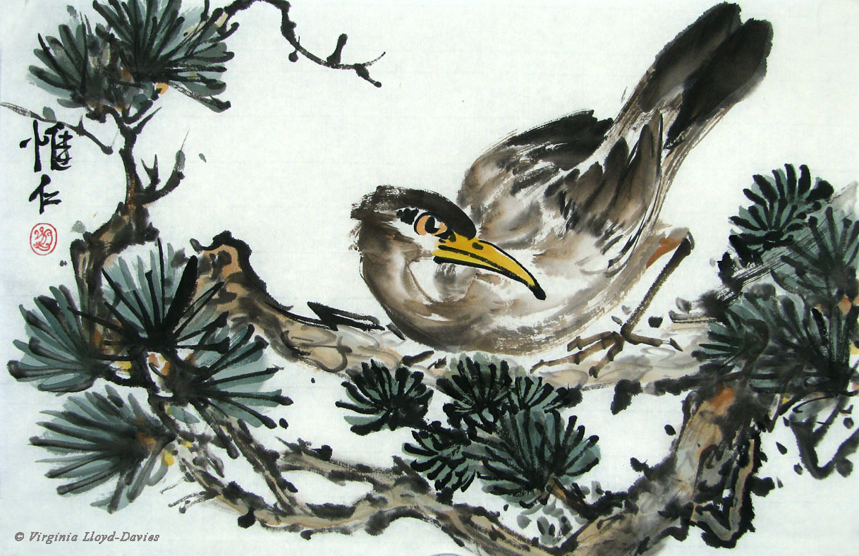
Bird About Town
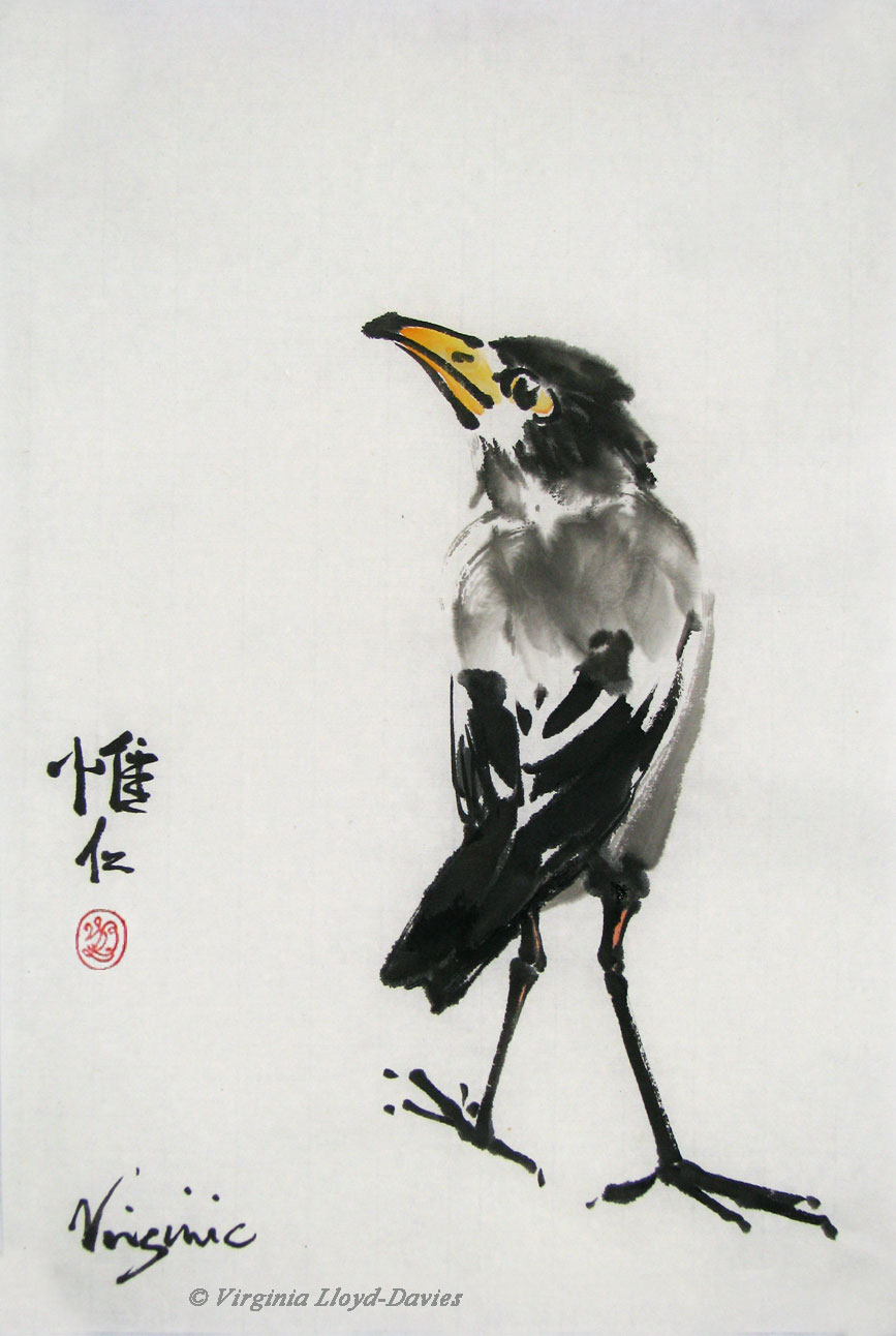
Here we have a sophisticated strutter with his nose in the air. I suspect his feet are going in the wrong direction, but does this really matter?
- Published on

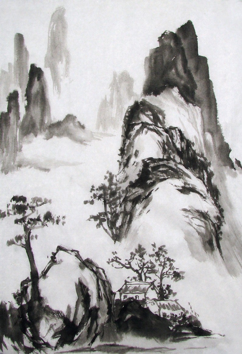
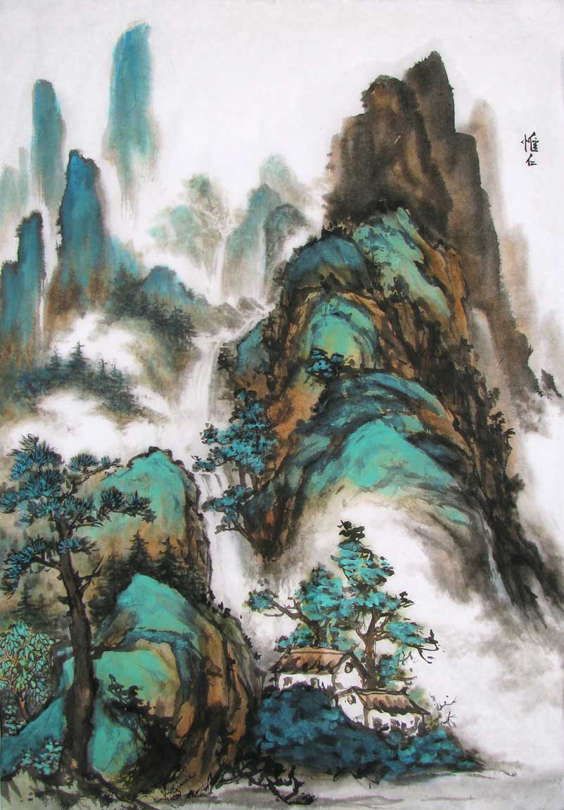
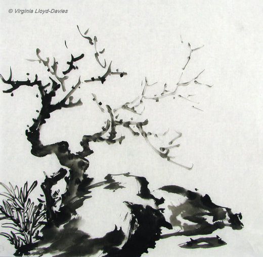
Springtime in the Mountains
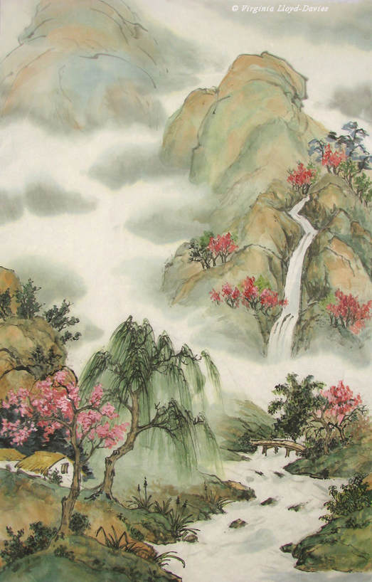
I painted this 18 years ago and I remember thinking I wanted it to be bubbly and springlike. I held on to it because I liked the airiness of the composition and some of the elements - the cabins, the willow and the bridge, for instance - but I knew I had problems with the waterfall and I positively hated my little 'bunches' of red trees. Clearly I had little idea of how to integrate rock and vegetation. It felt unfinished, but back then I didn't know how to progress the painting. I decided to see if I could 'fix' some of the problems as an exercise to train my eye to see alternative choices.

Areas to Work On
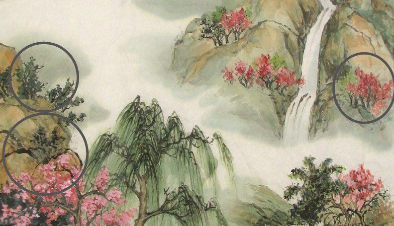
Here are some of the areas I decided to change. I will add more bluish-green pines on the left behind the flowering tree. My reason is to hide the nasty humpy black hill strokes (bottom left circle). Above them, I will make those trees on the left a bit bigger (second circle) because they are the same size as the nasty little red trees on the right and they need to be bigger because they are closer.
Pines Added on Left and Right

I'm still unsure of what to do with those wretched little red trees on the right. I have added some more pines below them which has helped to make the wretched reds recede a bit, but it has also cut off part of the layer of mist (that white band) which, in Chinese painting vocabulary is the equivalent of "....." meaning: there is more landscape between the two layers but the mist indicates that things are further back.
- Published on

Black Ink Sketch on Mulberry Paper
Using just black ink and shades of grey, I started off sketching the rock and tree on the left and worked my way up the scene, spraying lightly with water to dampen the paper in the distance. This softens the outlines. My mulberry paper came from Blue Heron Arts, where you can find an excellent selection of paper, brushes and other painting supplies.
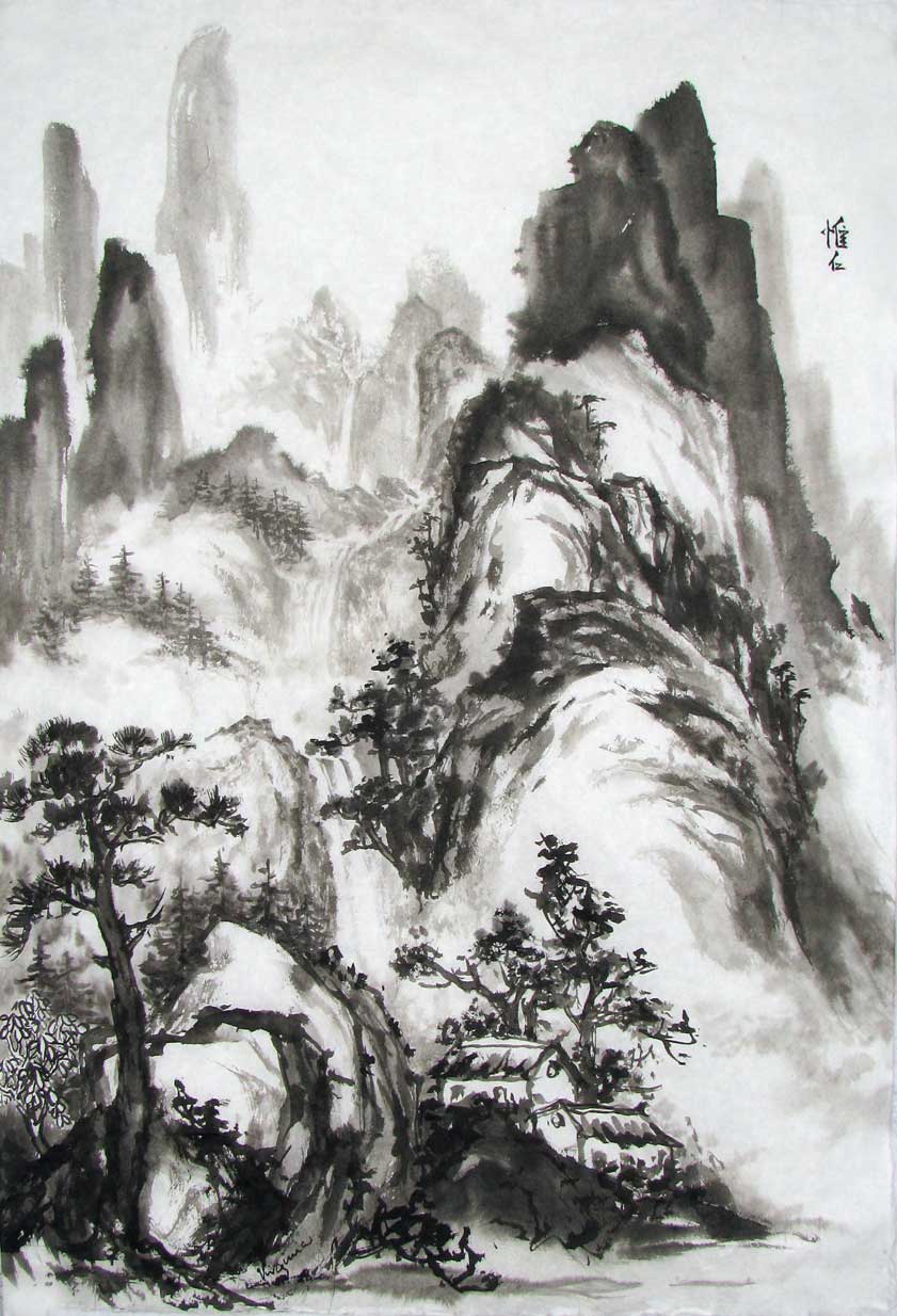
Completed Black Ink Sketch

Rather than leaving the center area open for mist, I opted for showing a meandering waterfall in the distance. I left several areas open for mist.
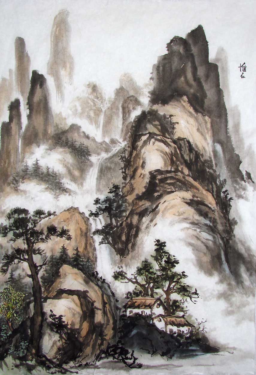
First Layer of Color

Adding light color....Uh-oh, it's all looking a bit brown! The addition of color has taken away from the strong contrast between the black ink and white paper, leaving it looking a bit muddy.

Second Layer of Color
Hmmm, I've added a bit of light, transparent green to the mountains, but it still looks a bit dreary.

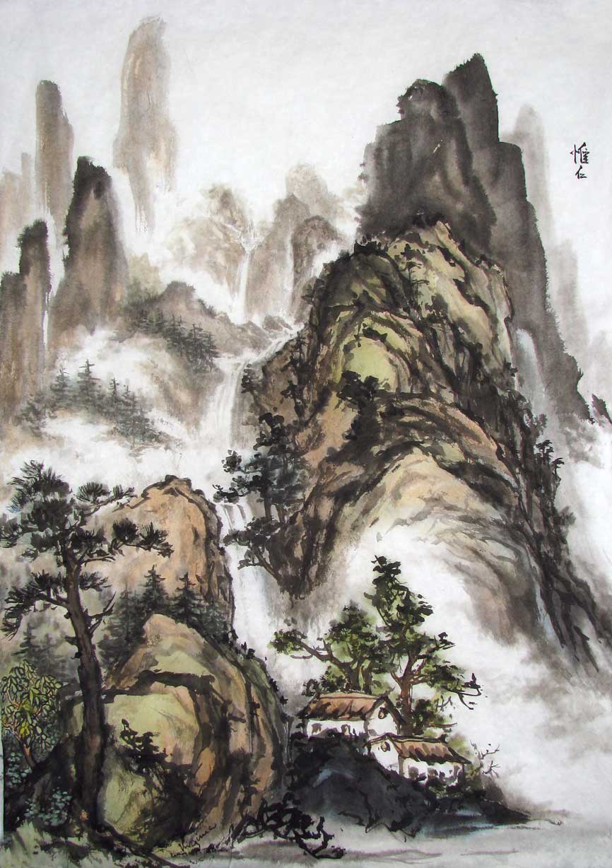
Third Layer of Color
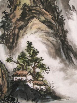
Wahoo! I've intensified the brown on the sides of the rocks and added mineral green and blue! Here's a closeup comparison of the house area:

Mountain & Houses in light colors
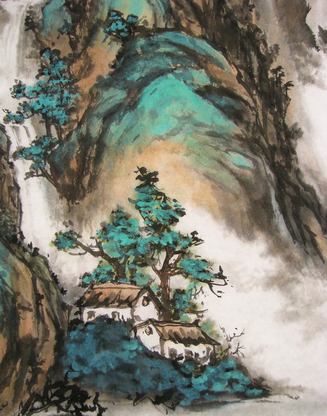
Mountain & Houses in Mineral Colors

Traditionalists might feel I've gone a bit Disney, but the use of mineral green and blue in Chinese landscape paintings goes back hundreds of years. You can see some examples here. And now the final version, complete with chops:
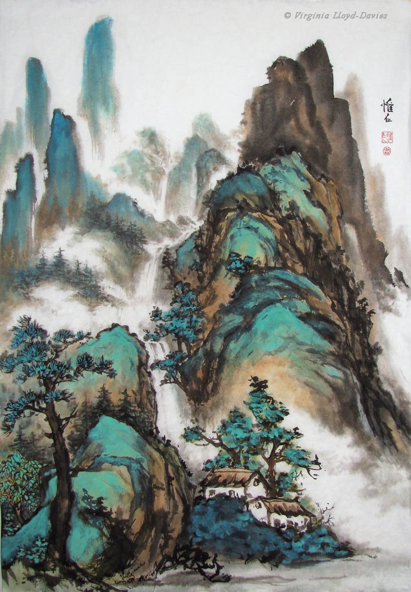
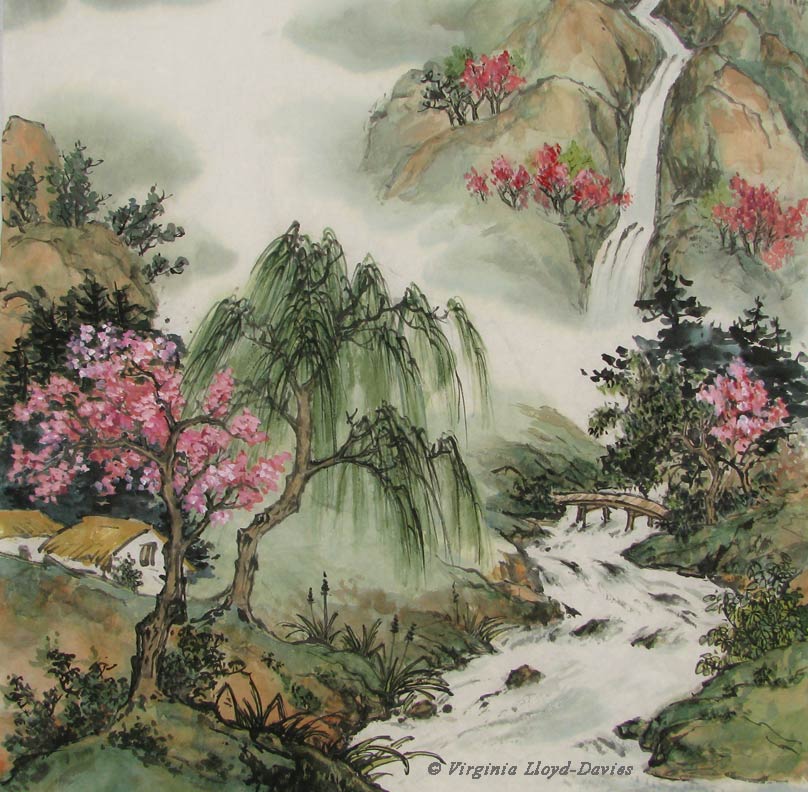
Cosy Cabins in the Mountains

Sometimes 'going for broke' is the most fun of all. I had no idea if the mineral colors would be too much, but I really like it, which is ultimately what counts. Break the rules! Find your own style! It's just a piece of paper, after all! Good luck and happy painting!
- Published on
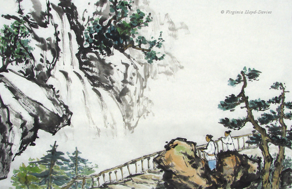
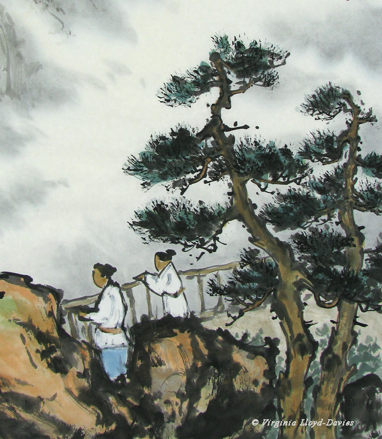
How did I get here?

Admiring the Waterfall
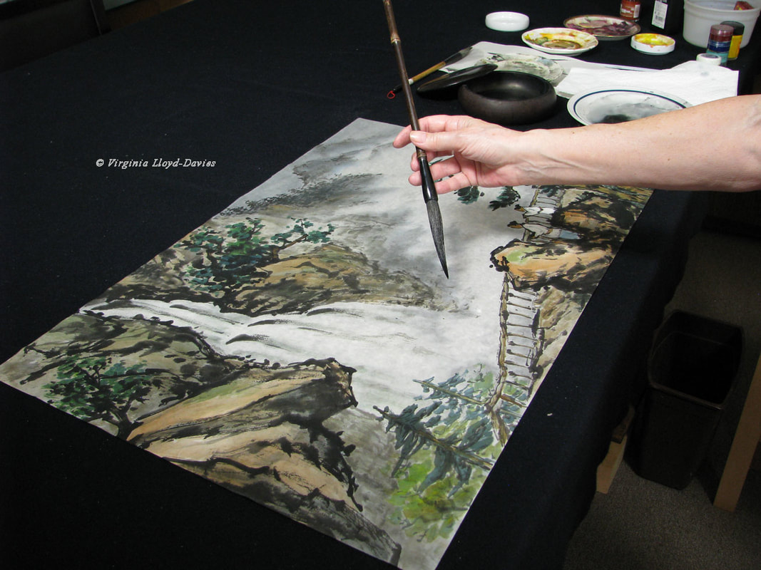
When a painting is finished, the elements should lock together like a well-crafted story. You feel the inevitability of the composition but the steps to reach the conclusion are no longer evident. I paint in what is called "Splashing Ink" or "Spontaneous Style", which means that it is more the dance of the brush that leads me on. However, I do still follow a process, so I will be putting in the broad outlines before adding the details. As my teacher Professor I-Hsiung Ju would remind me: put the roof on the house before adding the drapes and furniture! So let's break down this painting's process, step by step:
Since I had no composition in mind, letting this long, bouncy brush (from HMay Art) spring from rock to rock seemed like fun. My paper is a thin, raw xuan so my brush needed to be on the dry side. I loaded it with grey then added ground black ink to the tip of the brush.
Tip: It's always a good idea to keep a scrap of practice paper next to your ink so you can check the color and the amount of moisture on your brush before touching your painting.
Tip: It's always a good idea to keep a scrap of practice paper next to your ink so you can check the color and the amount of moisture on your brush before touching your painting.
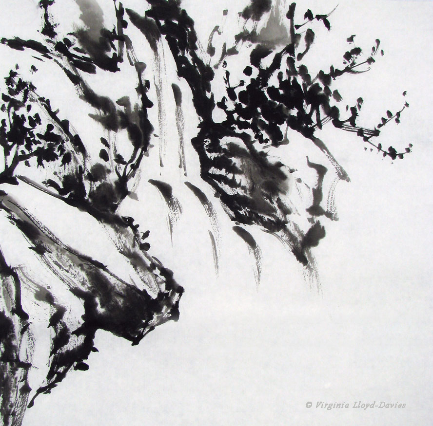
Step 1: Black Ink Sketch of Waterfall

Some of the strokes look almost abstract. How about some foreground to help the image to emerge? As soon as I add foreground elements, the waterfall will recede and I will have more sense of depth.

Step 2: Add Foreground Trees & Rocks
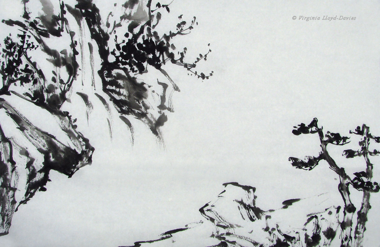
Since the waterfall has a diagonal motion, it's good to have the foreground moving on the opposite diagonal, creating a V shape.
Tip: Avoid having anything begin or end right in the corner!
Tip: Avoid having anything begin or end right in the corner!
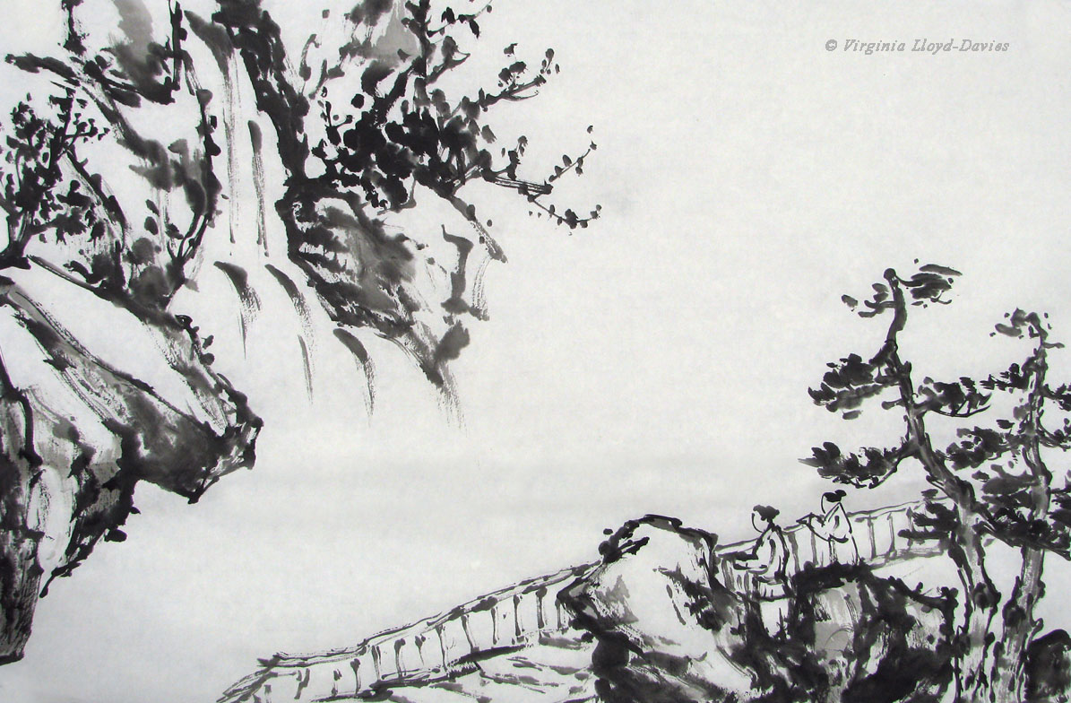
Step 3: Add People and Railing

Oh look, it's a viewing platform! In that case, I need people. True confession: the child on the right ended up too short, so I added another rock this side of the figure to cover up my mistake, thereby adding another layer of depth. The rock's a bit heavy, but you probably wouldn't have guessed my sneaky save!
Tip: Switch to a smaller brush for figures (I used my Happy Dot brush from OAS). If you're not sure what size to paint the figures, try them out on a separate piece of paper and place it under your painting to see if it looks right. Keep trying until it looks good. If I had followed my own advice, I might not have needed to stick in the rock!
Tip: Switch to a smaller brush for figures (I used my Happy Dot brush from OAS). If you're not sure what size to paint the figures, try them out on a separate piece of paper and place it under your painting to see if it looks right. Keep trying until it looks good. If I had followed my own advice, I might not have needed to stick in the rock!

Step 4: Start Coloring
If you add color lightly, you can always change the hue or the intensity. I added some light trees in the lower left to push the waterfall back a bit. I'll add a bit more detail to these pines later.

Step 5: Mountains Complete the Bones of the Composition
I've added white to the observers' clothes, so that when I add the background misty wash, the figures will stand out more. I've extended the landscape off into the distance, being careful to keep my greys light. If I added black to the mountains I would need to darken everything from that point forward.
Next I need to create the mist, and for this I will take the painting off the easel.
Next I need to create the mist, and for this I will take the painting off the easel.

Step 6: Creating the Mist

This is the painting on a black blanket. I created the background wash by spraying the painting with water and adding color on the backside of the paper. This allows a softer effect for the mist. I used indigo and black ink with a lot of water for this.
Tip: take into account, when you are mixing your color, that it will dry much lighter, especially when added to the back of the paper. Of course, if it is too light after it dries, you can do another wash.
Tip: take into account, when you are mixing your color, that it will dry much lighter, especially when added to the back of the paper. Of course, if it is too light after it dries, you can do another wash.
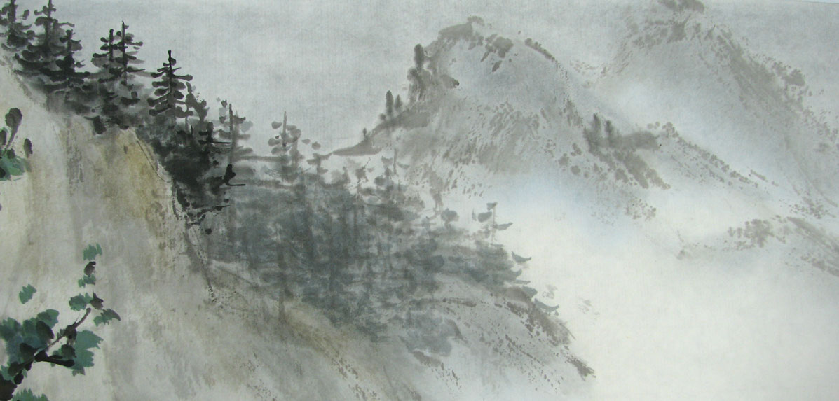
Step 7: Adding More Contrast to the Distant Trees

The trees and mountains in distance all looked the same shade of grey, so I darkened a few of the trees on the left which makes them look closer and adds more gradation to the depth.
Splitting Hairs!

Sometimes you don't want your brush to come to a point. I decided my pines in the foreground needed more detail, so I added an impression of needles by splaying my Happy Dot brush (OAS) and dipping the tips in pure black. This way I don't have to paint every single needle.
Step 8: Adding Detail to the Foreground Pines

The pine trees are now bushier and more elaborate, which works for trees in the foreground.
Tip: As trees are further away, add less detail.
Tip: As trees are further away, add less detail.

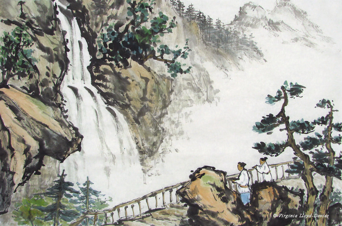
Step 9: Admiring the Waterfall
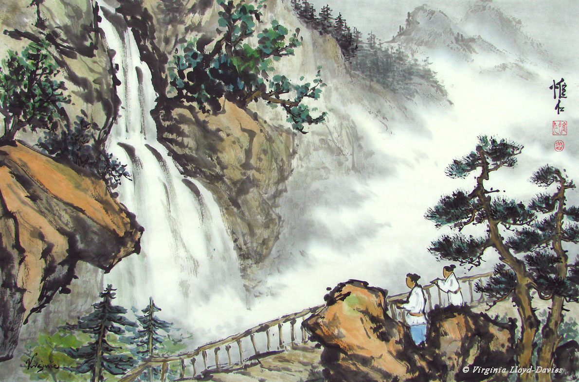
Admiring the Waterfall: completed painting. It measures 27"x 18" (69 cm x 45 cm).
Did you enjoy seeing how it developed? Did the breakdown step by step make it easier to understand? Do you have questions? If you painted it, it would turn out differently, and that's the delight of Chinese brush painting - because the composition is a living, breathing thing, your personality, thoughts and emotions will imbue the painting with your magic. Why not give it a try? You can follow along with these photos as you paint. Have fun splashing in the ink!
Did you enjoy seeing how it developed? Did the breakdown step by step make it easier to understand? Do you have questions? If you painted it, it would turn out differently, and that's the delight of Chinese brush painting - because the composition is a living, breathing thing, your personality, thoughts and emotions will imbue the painting with your magic. Why not give it a try? You can follow along with these photos as you paint. Have fun splashing in the ink!
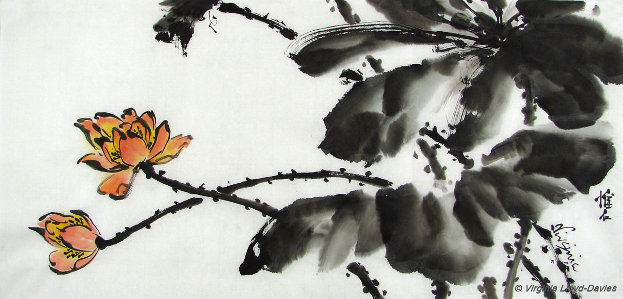
- Published on

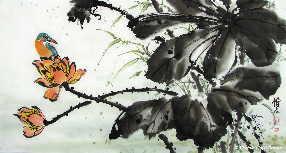
I started this sumi-e painting of Lotus and Kingfisher on thin, raw xuan paper from HMay Art (HM 004). It’s a good paper, but like all papers, it takes getting used to (note: this paper comes in white and an off-white antique look. I used the white.).
Step 1: Black Ink Mixed with Water

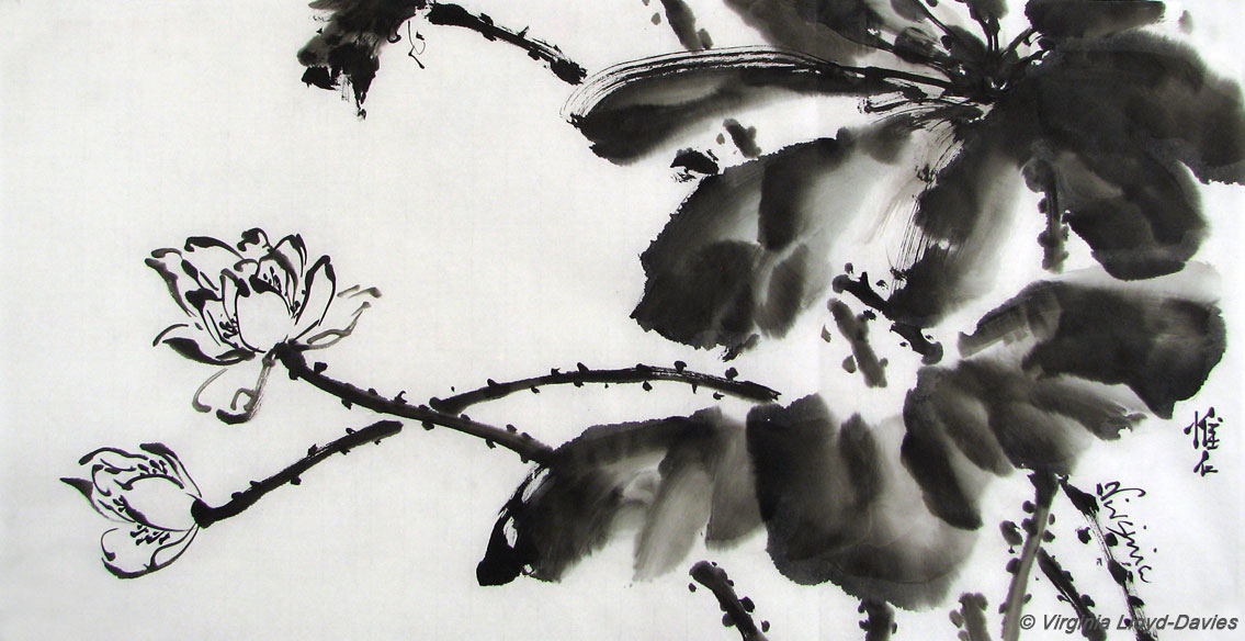
For the leaves, I chose a large brush from HMay Art that holds a lot of ink and water. The paper was runnier than I expected and the black lotus leaves on the right lost their crisp edges as the ink spread. To prevent the flower petals from running, I used pure black, which was a bit harsh to my eye. Grey would have been better. I was tempted to throw the painting away and start again, but I decided to push it a bit further.
Step 2: Coloring the Flowers

For the flowers I used a combination of yellow, orange and red (Marie's Watercolors). Coloring the flowers shifted the attention from the leaves to the flowers, but those blurry leaf edges still annoyed me. You can watch me paint lotus flowers here.
Step 3: Adding Background Elements
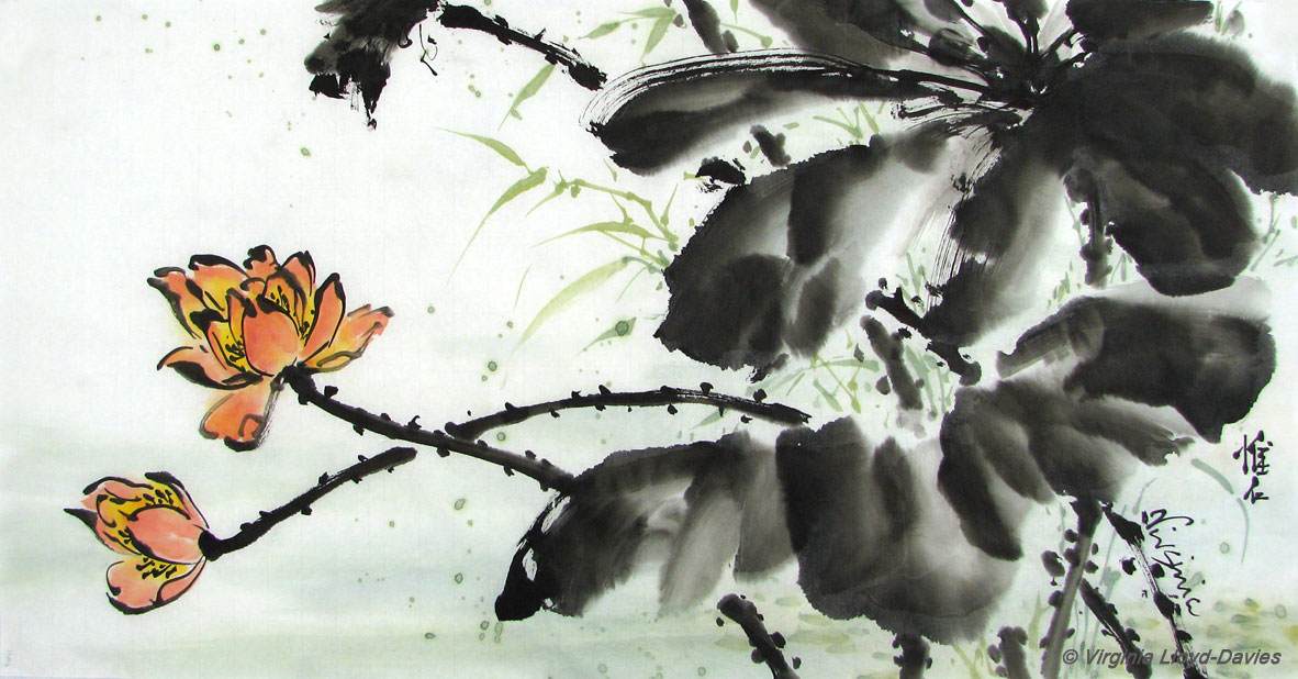

To give depth to the composition, I added green grasses and splashes of color in the background. I painted them lightly so they wouldn't compete with the foreground leaves. Unfortunately, my delicate strokes were totally overpowered by the black leaves and merely looked wimpy.
Step 4: When in doubt, add Outline!

Adding veins and strong black to the edges of the lotus leaves gave them more focus – which of course made the grasses look even wimpier. A little grey outlining on the grasses, however, gave them more weight, while still keeping them in the background.
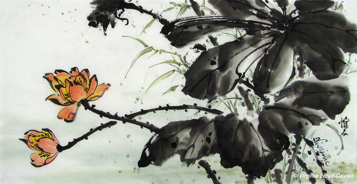
Step 5: Taking a Risk

At this point, I decided to throw all caution to the winds and add a bird, always scary when you hope it will be the crowning glory of the painting but could turn out awful and ruin the whole thing. The kingfisher's belly color combines with the flower tones and leads the eye upwards, giving more mass to this flower and emphasizing its importance compared to the second, smaller flower.
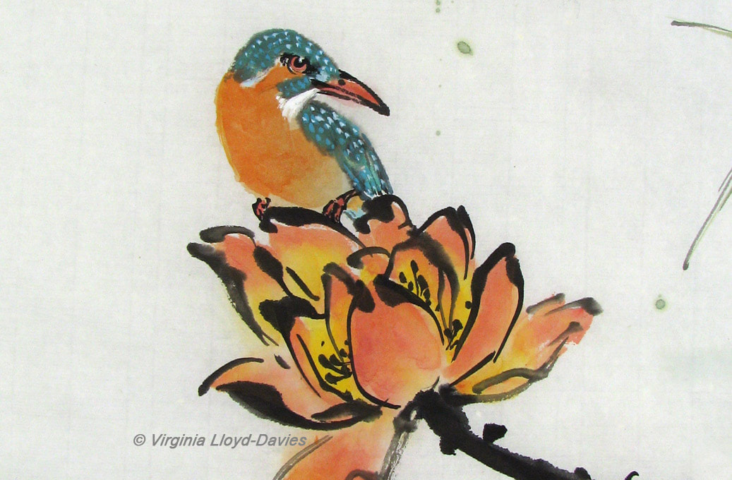
Step 6: Success! Risk Pays off!


Success! Adding the kingfisher firmly stole the focus of attention from the leaves, but the bird’s turning head draws the eye back to the leaves, keeping the viewer – I hope! – happily roaming round in the scene and discovering more details.
The painting measures 14"x27" (35 cm x 68 cm).
The moral of the story: Never give up! The worst that can happen is you end up throwing away a small piece of paper! In the meantime, you are training your eye and your critical faculties to see possibilities, and you are splashing in the ink, which is always fun! Good luck and happy painting on your lotus!
I welcome comments and questions, so don't be shy!
- Published on
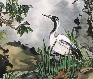
How did that crane get there? How does a landscape develop? Where do the ideas come from? Have you wondered sometimes just where the image came from? In some centuries, artists were encouraged to 'follow the masters' and not invent their own compositions. Some contemporary Chinese painters start off with a clear plan in mind; others - like myself - allow the story to unfold stroke by stroke.
In most cases, the landscape starts off with trees and rocks, establishing the foreground. Here, I have suggested either a path or a stream with the rocks; I am leaving my options open because I have no composition in mind yet.
With a bouncy brush (Inkston #0503) I am letting my strokes dance on the paper - the rocks are hard and forceful, the trees are vigorous and intertwining. This is the most fun part! I don't have to think too much because I still have plenty of options. One tree has outline leaves, one has green leaves which will get veins added later, and above all arches a sprightly willow.
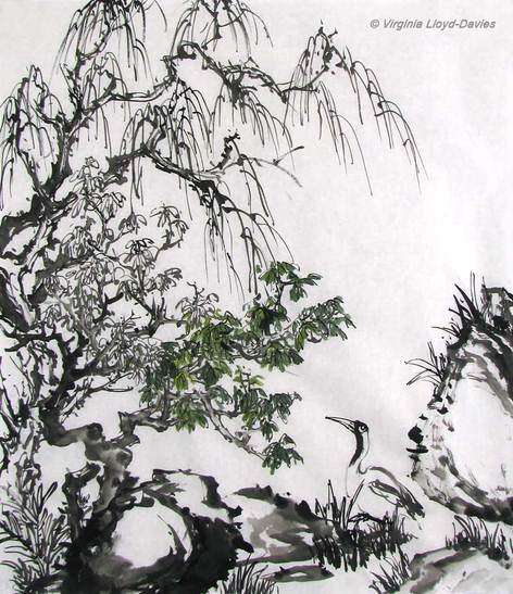
Aha! The crane has popped in! The way the rocks arrowed down to a V made a natural place for a focal point. I could have continued the path or stream to lead the eye back into the painting, but given the size of the rock on the right that option seemed a bit cramped - options are starting to narrow! Putting the crane there looking towards the front gives another layer of depth to the composition.
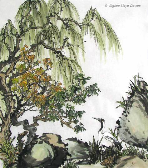
Time to color: I'm using Marie's indigo and yellow tubes, and brown and orange chips from Blue Heron Arts. The colors are a little pale at the moment and I will strengthen them when I put a wash on the back of the paper. This is a thin, raw xuan, with a high percentage of Wingceltis bark which allows for a good flow of color, while still maintaining crisp outlines (Inkston Perfect 70 xuan).
- Published on
- Published on
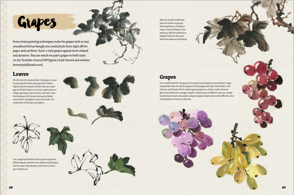
Here are the basics:
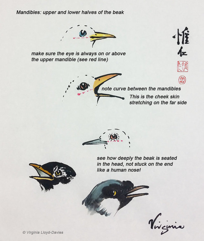
Annotated Bird Beaks

The Chinese brush style of painting that I demonstrate is called 'spontaneous' or 'splashing ink'. It is also known as 'paint the idea'. When we paint birds, we are not looking to produce a photorealistic bird, but more the idea of 'birdy-ness'. So we may exaggerate the beaks and eyes to bring out character. Frequently the birds are making a commentary on the rest of the painting so the birds need to have an aliveness that we can read into. Click on "Read More" to watch a video and see how to paint them.